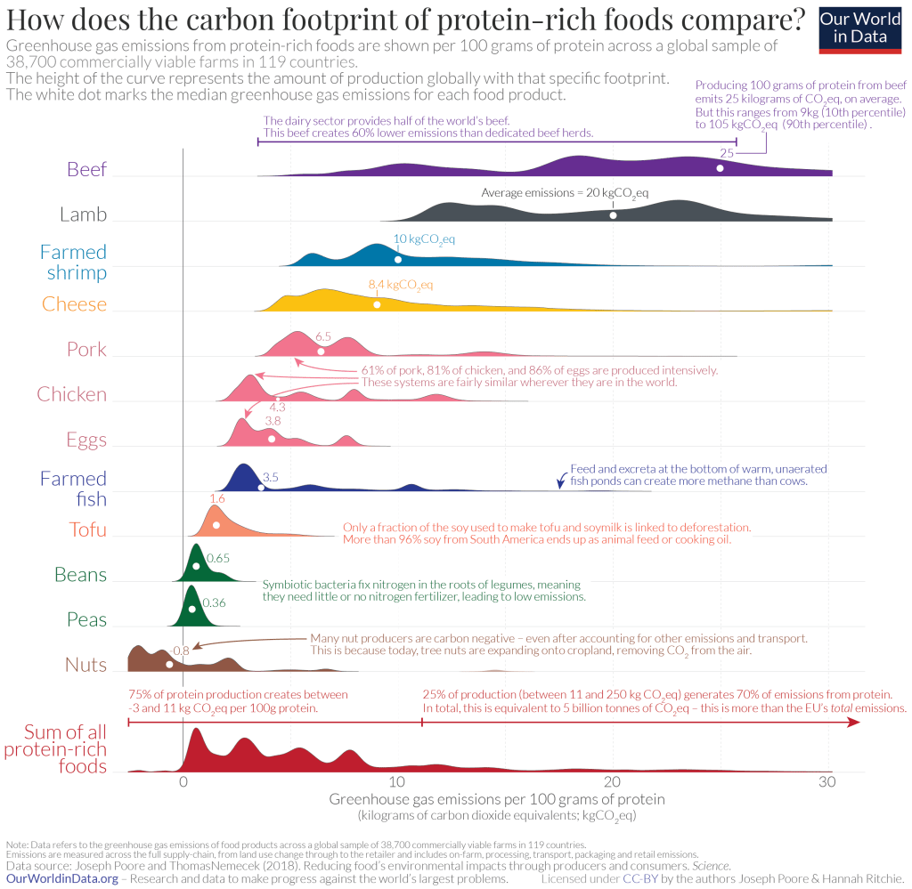
Check out the two charts below for a great visual presentation of the carbon and methane emissions footprints of different foods.
Designed by Hannah Ritchie, a researcher at the University of Oxford, they’re based on this 2018 study in the journal Science, and were originally published in two reports: “Focus on what you eat, not whether your food is local” and “Less meat is nearly always better than sustainable meat.”
Click each chart to see a larger version.
P.S. I found these charts while reading this recent Vox article about how the top 10% of global wealthy account for most of the world’s greenhouse gas emissions (in their pursuit of happiness).


